How not to write an email opt-out page
Periodically, I take a hard look at what shows up in my email inbox. Invariably a few emails are sitting there because I either opted in to something unwittingly or perhaps I opted in knowingly but now the emails have worn out their welcome. Either way, it is time for a purge.
This time around I noticed a stark contrast between two opt-out pages that I visited. Running down through several emails, I hit one from a credit card rewards club. I had been moving along at a nice clip, but upon seeing this page I had to stop and figure out what to do.
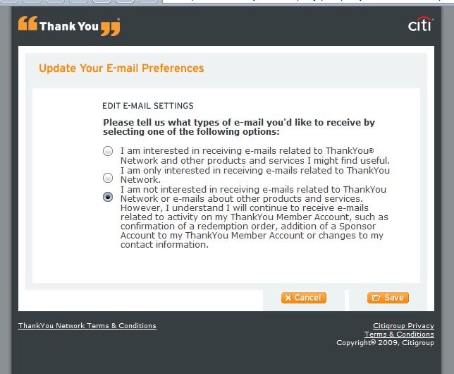
What is wrong with this page?
From a visual standpoint, it is not easy to see where the text for one option ends and the other begins. From a content standpoint, the copy is much too verbose. I just want to stop getting emails! Which one gets me there?
Forcing me to stop and think this way might be advantageous to Citigroup in that maybe I will be dissuaded from opting out, or opt to still receive certain emails. However, there may be a better way.
The next opt-out page that I visited was that of Zzounds, an online music retailer.
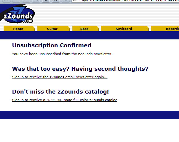
This page is awesome on a number of levels. In addition to the simple and easy to scan layout, the default action was performed for me. I didn’t have to figure anything out at all to get what I wanted – to stop getting emails. Not only that, I really was thinking “did that actually work?” and the page copy confirms that yes, it was “too easy”. I’m actually not annoyed that they are inviting me back to the list. In fact I’m almost feeling some goodwill here.
An email opt-out page is a point of customer engagement. Someone is expending conscious effort to do something, and from the vendor’s standpoint, that something is a negative event. But any time a customer is engaged is an opportunity to reinforce your identity in their eyes. I don’t have any metrics on the impact of an opt-out page, but this exercise has got me thinking.