elements — one to serve as a container, and another to serve as the backdrop color that will show through from under the transparent overlay. Here is the html needed (the boilerplate html tags have been omitted for clarity):
<div id="container">
 <div id="background"></div>
 <div id="overlay"></div>
</div>
Unfortunately we need a comparatively large amount of css, but it still isn’t so bad. Notice that the main trick here is that the container serves as the positioning parent for the two elements that make up the gradient bar. The #background and #overlay elements are absolutely positioned with the same height and width so that they will occupy the same x and y positions.
#container {
 position: relative;
 height: 120;
}

#background {
 position: absolute;
 background-color: green;
 height: 120px;
 width: 100%;
}

#overlay {
 position: absolute;
 background-image: url('images/white-grad.png');
 background-repeat: repeat-x; height: 120;
 width: 100%;
}
If everything is set up as expected, our page will look like this:
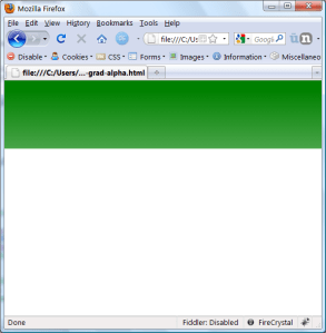
Not incredibly impressive until we try the following: change the background-color of #background to black.
#background { … background-color: black; … }
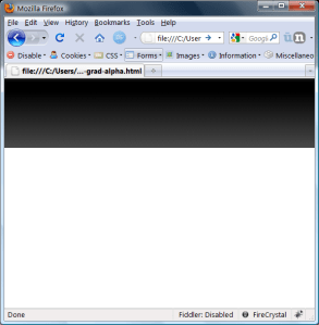
Now the gradient bar is black, and we didn’t have to go back to Gimp to create any more images.
If you look closely at the images you will notice that the main drawback of this method is that the gradient is not very smooth. I only tested this in Firefox, so maybe it looks better in other browsers. It doesn’t matter to me since I will create the desired png file when I have my color scheme figured out.
Hopefully this technique is useful to someone, otherwise just grab one of the fancy Javascript gradient libraries that I listed above and get to it.